SoundCloud Pulse Redesign
UX / UI Design
🛠: User Research, Adobe XD
Overview: A case study on the SoundCloud Pulse app, in response my and fellow musicians’ critique of the app as a supplement to a ubiquitous platform.
Goal: The iOS app has huge potential, but the features haven’t been fleshed out and there is a little visual inconsistency to be tied up. The users I interviewed would re-evaluate the added features in context to see the success (which turned out great). I expected the response would be positive given the low hanging fruit in the app — I had some ideas of where to go before I even started.
Solution: I cleaned up the visual aspects to create a more distinct and intuitive system. I added functionality based on market and user research. These were around the high level goal of streamlining the user flow.
The outcome: A polishing of the Pulse app. The user flow’s foundation was mostly solid, and so, outside some minor flow tweaks, the visual design needed to be brought to the same level.
A LES NOMBRES:
SoundCloud, founded in 2007, is a private German music platform for music distribution and sharing. With 76m registered users, it has a monthly reach of 175m and 12 hours of music are uploaded every minute. Estimated at 700m, the platform has 1.2m creators and is ranked #3 on Apple’s App Store (behind Spotify and Pandora).
I absolutely love the platform. My experience has been great as a DJ (although the upload limit is harder to work with). As part of local group Jazz & Grooves, we find our performers through SoundCloud as many up and coming artists build their fan base there. It’s the platform for true music fanatics — much like the old days when you could walk into a vinyl store and stumble upon great new music on your own judgement (although it increasingly moves closer to other platforms with recommendation analytics).
SoundCloud Pulse is the creator app for on-the-go analytics (and has a web equivalent). It’s #96 in social networking on the App Store, and it aims at a variety of users. The unique feature about SoundCloud is the interaction between artist and listener: it’s greatest strength as a platform is music as a social media, and Pulse offers an opportunity for artists to be constantly connected.
User CONTEXT
I use a human-centered design process. With access to music groups and my own personal experience, I interviewed just under 20 people. I identified three major groups of people that I would design for, and I spent time trying to understand their behaviors and train of thought. These allow me to identify task flows and behavioral priorities to help wireframing. Around here, I would do a competitor audit, but unfortunately Spotify and Apple lock their platforms through record label verification.
User #1: Sam, the professional artist.
“I’m constantly messaging and cold emailing venues and labels for new gigs and artists to collab. There’s no unifying framework to do that, and it is frustrating to look through artists profiles to find their unique method of contact.
Whenever I play somewhere new, I’m always either a huge hit or a miss. However, I can’t track the details of how well I do on the go. During gigs, I’m in the zone. Outside of the gigs, I’m too busy traveling and networking to make time to go to my desktop.”
A long time user of the original app, he monetized the platform and embraced it as a social media. Sam is a regular user of Pulse to keep track of stats on the road.
He always has new gigs in new areas, which means new and different populations are consistently exposed to his music.
Detail of use: Shallow checks multiple times a day, every day. Built into his daily routine.
Opportunities: Messaging service and intuitive, quick statistical tracking.
User #2: Clown and Sunset Representative — a record label.
“We manage hundreds of artists. We’re always watching how our new artists are doing in conjunction with their live shows. Hours are spent studying the changes that we track to understand how our audience reacts to our actions.
It influences how much attention they get from us and how we tailor our promotions to different areas."
Managing artists means a lot of uploads and even more promotional events. Rapidly changing user landscapes requires detail, detail, and more detail.
Detail of use: Deep dives every day to make meaningful observations.
Opportunities: Customization for fine-tuned statistics for both tracks and regions.
User #3: Jordan, the nascent artist.
“I just started making music. 3 people have dropped a comment on my first track with positive feedback. I keep a watchful eye on the main platform but check Pulse once in a while, so it’s exciting to see whenever there’s new data. I like the pretty bar charts, though the rest of the app is a little meh.
I’m always texting people but there’s no messaging on SoundCloud mobile. I respond to everything to link with my audience.
Pulse brand is slacking. Visual identity is the real estate we occupy in the users mind of expected quality.
His primary goal is to extend reach and impressions (through features, interactions, etc.). No messaging means he is disincentivized to connect to people on SoundCloud.
Detail of use: Infrequent checks but meaningful interactions.
Opportunities: Visual clean-up and critique of user experience. Messaging service.
Design Process
A quick note on my attitude before we dive into the cake: I believe in essential and clean design that feels a part of a world. John Maeda’s Laws of Simplicity were particularly influential when I was younger. I design concisely with the goal of thoughtful execution on a handful of ideas. I prefer to be straightforward.
On a high level, my design goal was to tailor the app for the identified personas, given the opportunities identified. I sketch ideas and chart flows before I touch and keyboard or mouse. Sketching helps me focus on the core value add rather than the visual aspects of the app. In parallel, I do a visual critique of the platform. I then chart the redesigned user flow and use that to wireframe. The wireframes evolve into new designs. In this case, wireframing wasn’t necessary since this was a visual clean up.
CHARTING
I started sketching and noting ideas as I moved through the flow of the app.
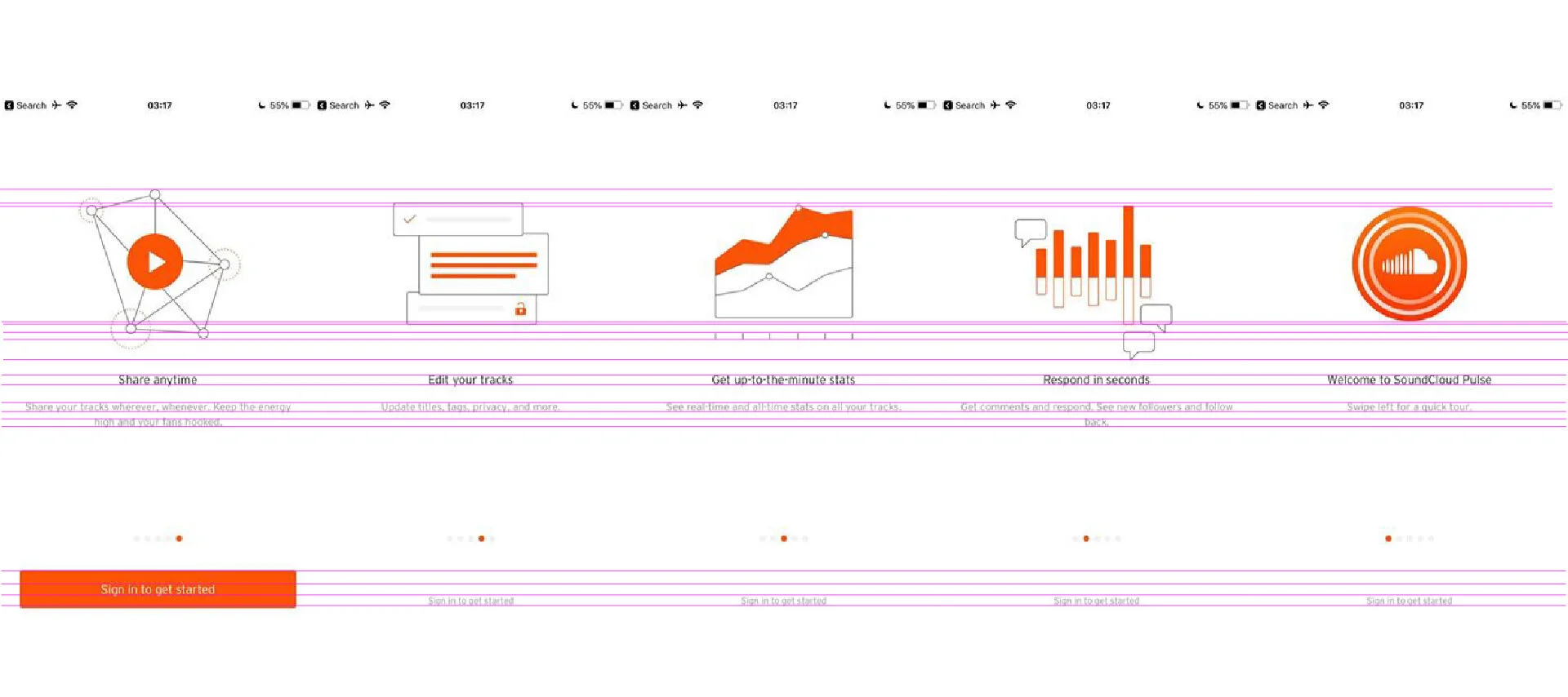
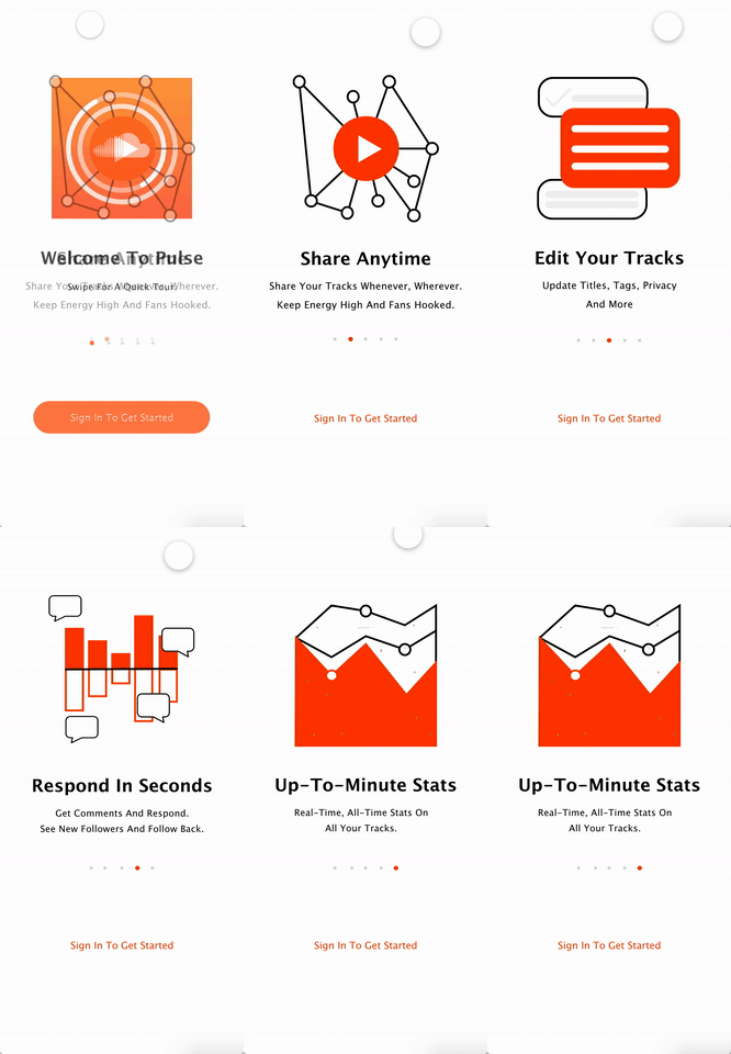
The first experience the user has opening the application is the onboarding iconography. These feel like they were drawn by different hands — stroke weights are different and use of color and fill vs. stroke varies. The icons don’t fit in the same space and so aren’t the same size. The solution here is to create a minimal but consistent system. I will redraw them to be balanced as an example of where they could start to go. Before testing it out, I think the type on the bottom would look better horizontal center aligned.
The first page of the permanent app interface is the Activity page. The major problem here is that the type isn’t layered consistently cross-platform and there is no visual hierarchy. It also lacks even spacing and there is a lot of white space that doesn’t quite hit the cool and clean white look every tech app seems to ubiquitously have. Unlike the Stats page, the Activity page lacks a bit of visual je ne sais quoi as the visuals are small. These issues are quick: I will resize them and the issues with the type.
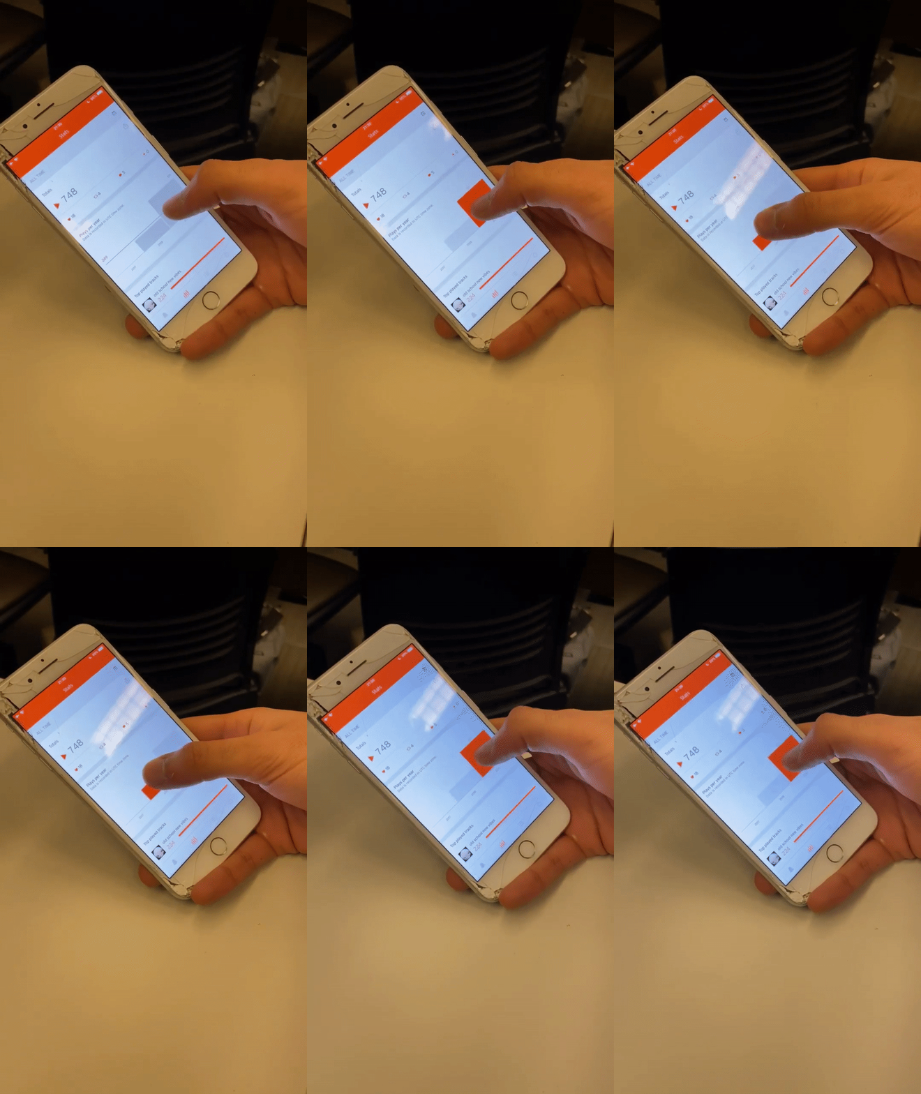
Triggered when pressed.
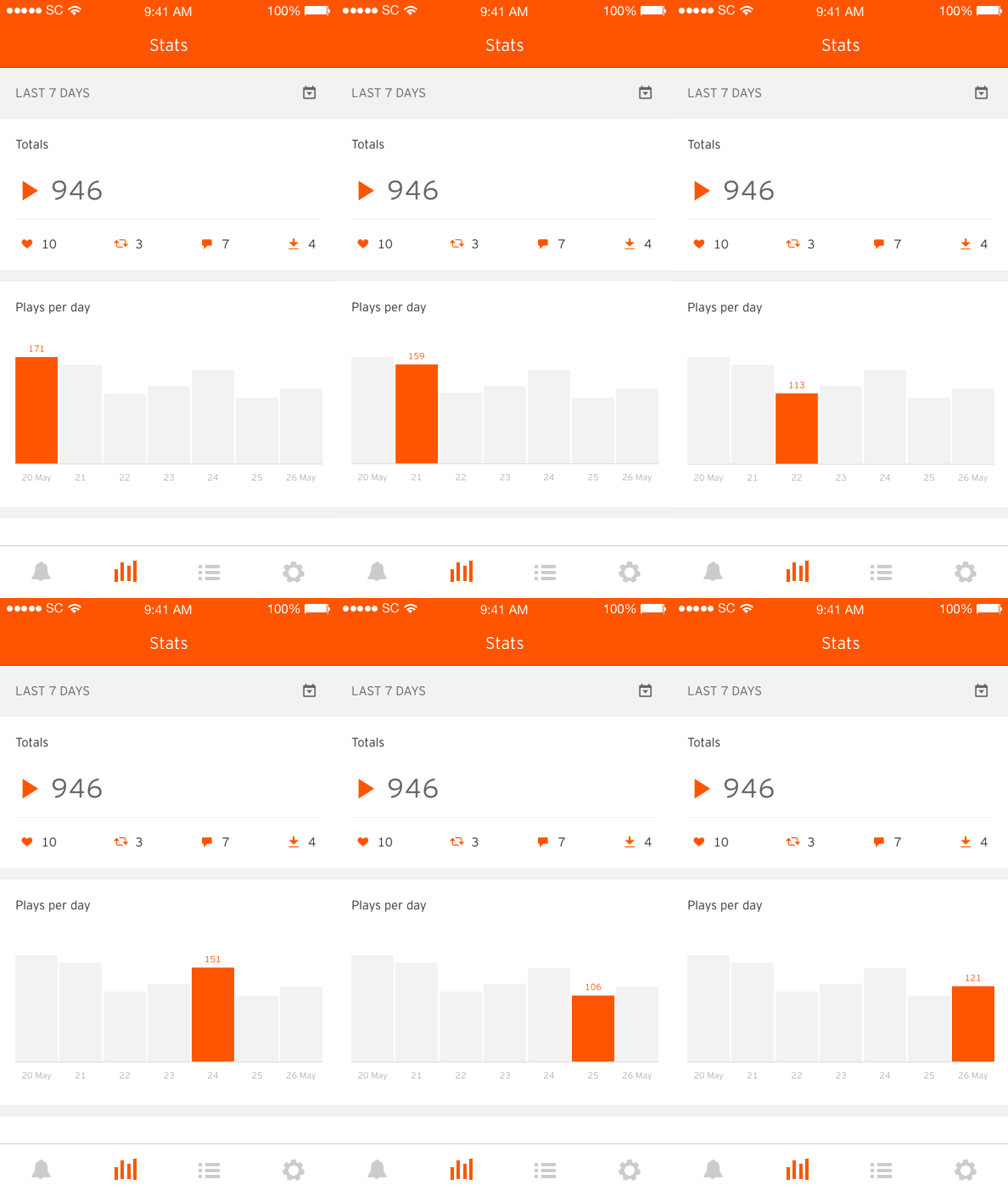
The moving interactive animation is an absolutely gorgeous and exciting feature, but it is unsuccessful when the plays vary so one’s thumb covers the number of the bar as they scroll, so that needs a slight tweak. The spacing in the categorized section isn’t consistent and again there is no type hierarchy. The desktop version has a grey section for tracks that are deleted that would provide useful for artist overall reach and cross-platform consistency.
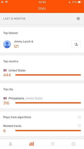
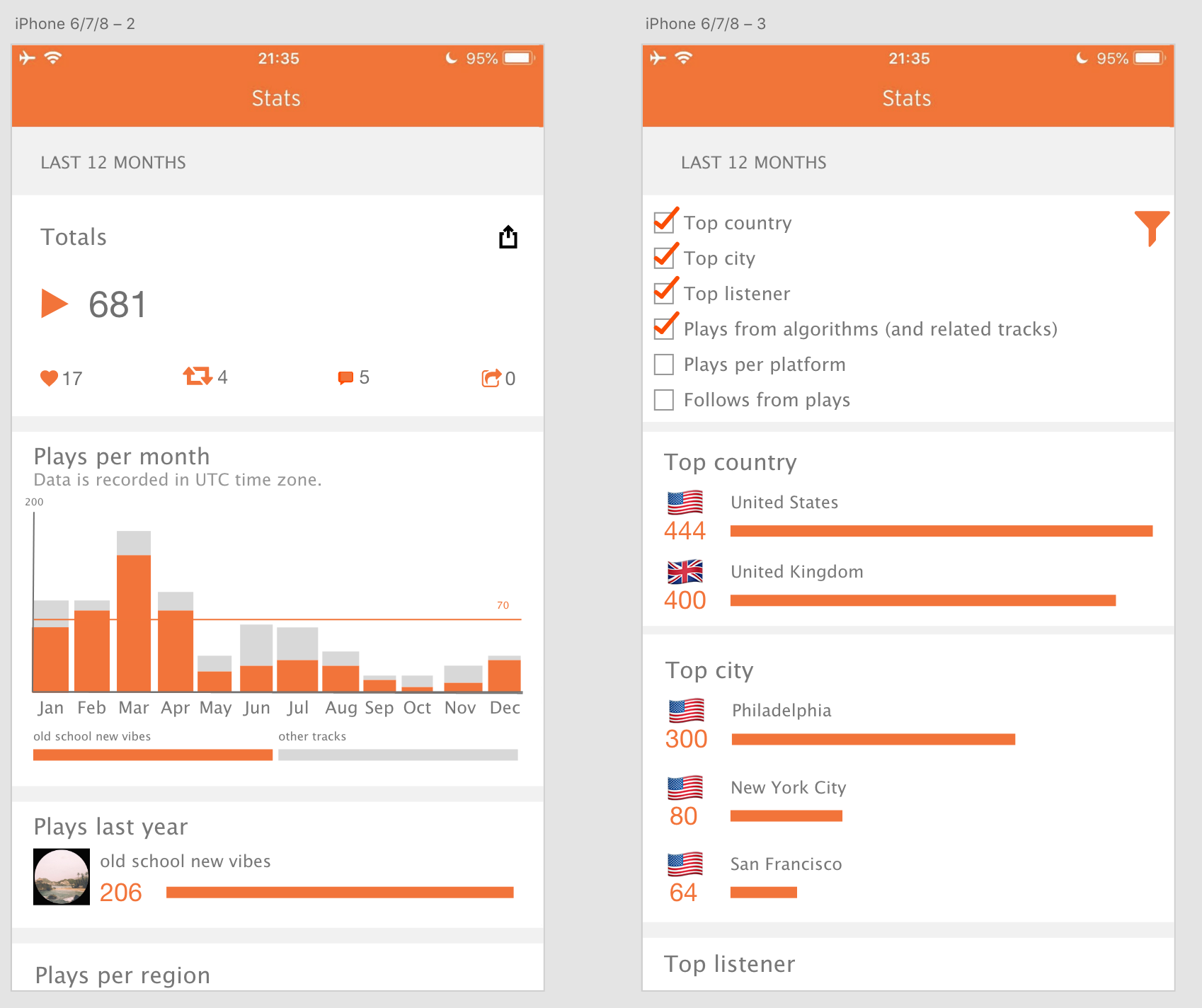
The information provided was received to be halfhearted — it wasn’t enough data to make meaningful observations (like the platform’s bar charts) but there was still a lot of redundant information that wouldn’t be required on the go. Our amateurs found the information at the bottom more relevant for larger audiences, so we can implement a filtering list and bring in some more analytics from the main platform. This would be useful to record labels who chart specific information very closely. Artists can also see how demographics might change with new releases.
This and the following bars were too small to read. It is even more likely a track will vary within a given week.
This information isn’t useful for Jordan. Given he posts infrequently, this is long term information, not on-the-go.
Desktop version.
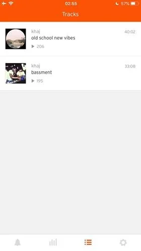
The tracks page is successful with its visual system and spacing, but it doesn’t show quick information of the tracks: you have to click in. This is not that useful when looking at track by track stats for new releases, like an album. For Jordan, a sharing option would prove useful so he could text new people he meets his tracks: every listen counts. There is unused space under the length of track for a share button. Overall, no crazy changes here.
Excluding settings, the last navigation is the one that doesn’t exist: our users and many reviewers rightly complained the app lacked a message feature. For Sam or Jordan interacting with venues or friends, a messaging feature would create dual value capture as SoundCloud facilitates their value proposition and helps its users with theirs.
VISUAL REDESIGN
Before jumping in, I built assets from around the application (like the signature SoundCloud orange and free typefaces mimicking SoundCloud’s Interstate with Lucida). Their visual system doesn’t suit my taste, but we work with what we got.
I quickly redrew the non-logo iconography to be more balanced, and added my touches so that they felt more fill than stroke. This demonstrates the idea, but if I was completely redoing the visual design I would do a full icon exploration and flesh out these in more detail. The icons all fit in the same proportion square!
The activity page was straightforward: I just needed to redesign the layout of the individual cards. Using repeat grid, you can cycle a handful over to get a feel for what it’ll look like together. My style guide helped me churn it out.
Design is information architecture — the presentation of the app can help artists aggregate information in specific ways. Enabling a filter so the user can select content helps in a myriad of ways. Record labels can only monitor the core information they need, while Sam, Jordan and other artists (professional or amateur) have free reigns to customize how much information they want to see.
Here I adjusted the hierarchy of the type and added a few rough features for the statistics to improve the similarity to the depth of the desktop app. Cross-platform consistency is important and the novel feature is great but has flaws and is unnecessary.
Here, for the tracks, I added a search bar and fixed the issue missing out information (the share, likes and reposts).
Here is a quick look at what the messaging feature would look like. People would increasingly connect and the dynamics of the app would change. Chad could reach out to Jaquie whenever he first starts publishing his music for advice, tips and potentially meeting up after a live set!
TAKEAWAYS
Is this the right solution? Two apps (vs. one) are harder to manage, and jumping back and forth between apps is frustrating for many artists who aren’t on the road but want a mobile experience just as clear as a purely mobile social media.
More tangible information rather than interviews from the same type of people would sway my design choices. I lacked the large amount of data and varied users that SoundCloud would have access to, and I haven’t seen the artist side of competitors Spotify and Apple Music because of record label verification.
Design is a conversation; I’m not a dictator and through the design process I build relationships of feedback with our target users and developers. Each developer has their own way of working and it’s important to prepare the work for convenient hand-off. After usability studies, we would iterate on the designs to optimize value for our users.
My experience in product and experience design has mostly dealt with physical or hardware products — this was my first time extensively mixing my product design work with digital design. It was almost synesthetic: I had to use both my visual chops and my practical sense to craft a little world to play in.


